A multi-tasking website for an outstanding college
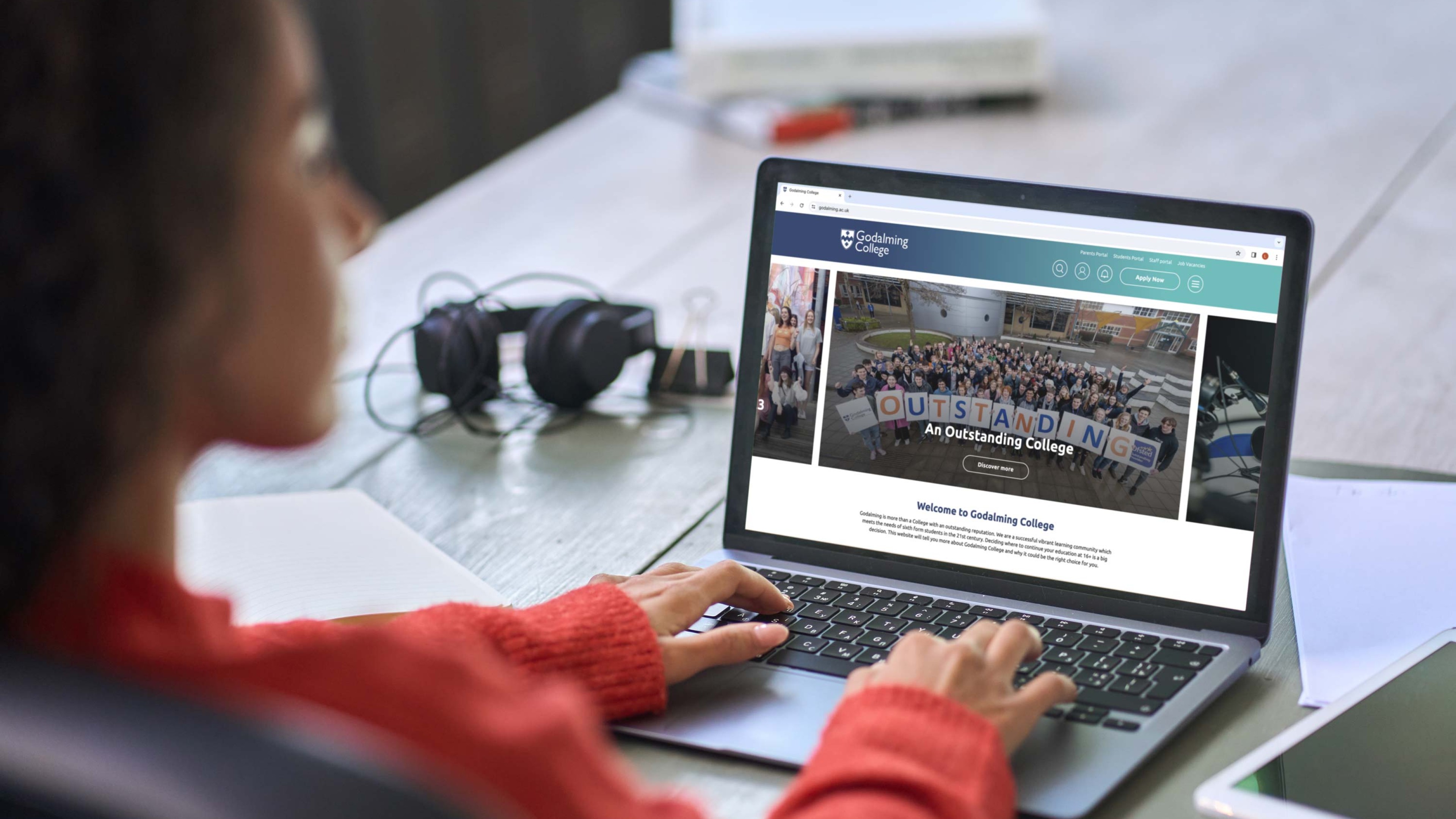
15 years since developing their previous website, Godalming College asked room 11 to develop a new website that would be fit for today’s student population.
The problem wasn’t so much the lack of Insta-ready imagery, but something more fundamental – the user experience. Access to the right information was challenging and the range of information felt overwhelming. Not only that, but the college knew they were missing a trick. Building a spanking new website meant the college could incorporate a CRM. This would be a gamechanger, making it easier to communicate with students and parents. It would also allow the college to collect and analyse data to inform a raft of opportunities.
The college asked for:
- A modern, responsive and compliant website that would be the go-to resource for current and potential students, their families and staff.
- A way of nurturing students through the application process.
- A tool to showcase students’ work.
- We set to work, scoping out the range of tasks that would need to be completed.
Transform the user experience
Usability was a challenge with the original website because of how information was presented on the site – mainly using PDFs. While PDFs meant easy content creation and uploading, they resulted in a poor user experience.
We got stuck in and took the information off those PDFs, turning it into live content. However, this presented a challenge in itself. The sheer volume of information related to certain topics was overwhelming.
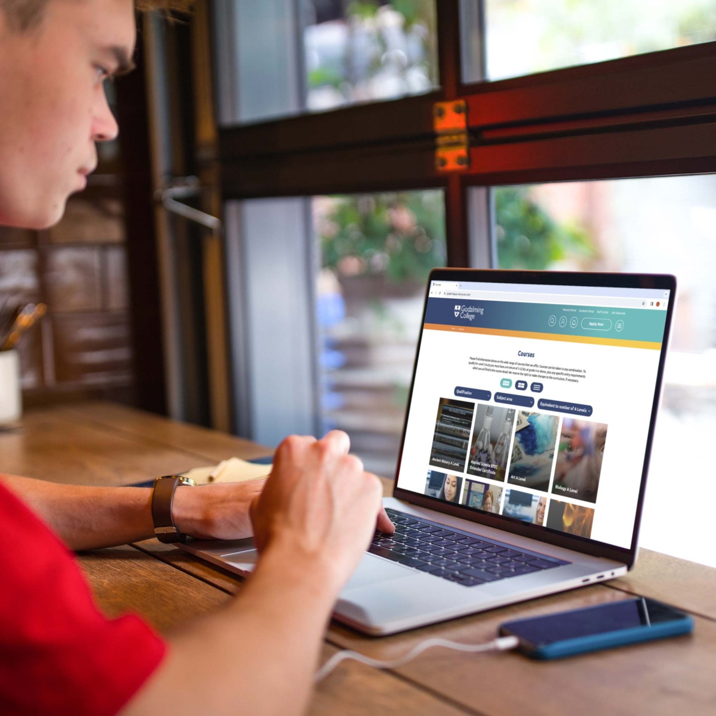
To get around this we carefully analysed the data on each page and laid it out in an intuitive format, using dropdowns to hide secondary information. We also used cross site linking for related information using blog galleries. This included details such as other courses the user might be interested in, enrichment programmes and case studies. What’s more, we ensured that the CTAs across the site were clear and concise, helping users get the information they needed.
Apply now
In many cases, the college application is the first time a student completes an application themselves. This made it especially important that the process was clear and flexible.
With the ‘apply now’ CTA used liberally across the site, we redesigned the entire application journey to make it simpler. A live percentage progress guide gamified the application to help reduce any overwhelm. Email reminder notifications kept applications top of mind, even if students paused their application to get extra information. A message centre, FAQs and embedded careers information app gave students extra help, creating a one-stop shop for their application.
The go-to resource
With a clearer page set-up, it was easier for all users to access the information they wanted and to learn about new opportunities. The college was also able to use the website to share information that would otherwise be difficult to communicate.
A new dynamic multi-part blog module allows the college to communicate news, events, case studies, student showcases and even staff vacancies with ease. We also added a website alert tool so the college can communicate urgent alert information – something that was especially useful during the pandemic.
Clearly signposted features such as an admissions FAQ page, chat resource, contact page and social media buttons make it clear where to go for extra information while it’s easier to access statutory information through a clear menu and search facility.
Back-office benefits
Building a new website created a valuable opportunity for the college to gather new information and communicate with students using the integrated CRM system. We refined the way the college gathers information – using defined options such as radio buttons and dropdown selectors instead of freeform text entry. This means it’s easier to carry out meaningful analysis and communicate with students with information that’s tailored to their needs and interests – especially important in the case of students with additional needs.
The new website also gave the college the opportunity to embed an ecommerce functionality into the website to allow for event ticketing. The ticketing functionality is currently used for free events with an emphasis on reducing no-shows, however, it also provides an opportunity for future revenue generation.
Going live
The main website went live in July 2021, with additional CRM elements and upgrades added throughout 2022. One of the most notable additions was integrating a full booking system for Course Advice Sessions (CAS). This was previously done manually which was time-consuming and open to human error due to the sheer volume of data and applicants involved.
Now, the admissions team adds available time slots through the website. The system then automatically sends emails to applicants inviting them to book a CAS, with confirmation and follow-up reminder emails sent on the day of their booking. At the end of the CAS, staff are prompted to choose whether or not the applicant should be offered a place. This triggers a series of automated emails and internal alerts to both the applicant and admissions team, which varies according to the option selected. Again, this helps reduce the time pressures on the admissions and IT teams.
With the project complete, Chris Hayward, the Marketing Manager at Godalming College said:
“I had a vision and room 11 made it a reality! It provided many challenges whilst building our custom website, but room 11 always worked it out and did it with good grace, the byword being ‘anything is possible’. We now have a modern, attractive, mobile-friendly website, providing a range of services, which we are able to manage ourselves. The initial investment has already had an impact on internal manpower efficiencies and of course, the biggest gift of all is that the customer feels in control, has timely communications, and has a really great user experience.”
We couldn’t ask for better feedback!
Beautiful
The admissions system is a beautiful thing; it is much easier to work the applications including CAS and has taken a load of work off!
Joe Yeadon
Director of IT & Digital Strategy
Why room 11?
Based in Godalming, near Guildford we have been designing visual identities and developing branding for organisations since 1997.
From local companies to large multinationals, we follow the same process to ensure we develop the right logo and brand identity that works for our clients.
Before we put pencil to paper, we work with you to get a deep understanding of:
- The business you are in now and possible new areas in the future.
- The size of your company, and the scale of your ambition.
- Your values, your personality, what’s important to you.
- Your competitors, and how you are different.
- Your target audience, and the channels to reach them.
Get in touch
We cater to all tastes, so we would love to hear about your requirements. Get in touch by phone or email and let’s start the conversation.
