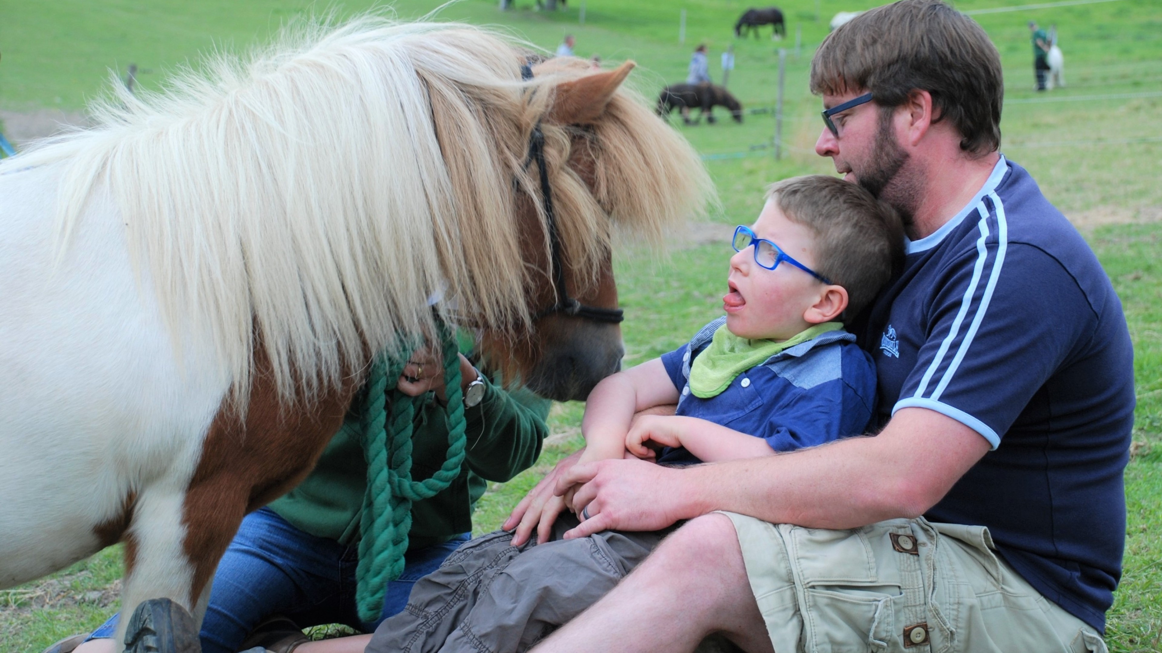
Mane Chance are a Surrey-based charity who rescue abused and abandoned horses and ponies.
They also support children, young people and vulnerable adults with equine-based therapies, education and volunteering opportunities.
Having had their existing branding and website for many moons, the team at Mane Chance were ready for an update. They knew what they wanted; a brand that was modern and appealing, and a website that would:
- Be easy to use.
- Talk to two different audiences – animal lovers and those concerned with the care of young and vulnerable people.
- Balance practicality with a strong emotional appeal.
- Encourage donations.
New look, new website
We started by cracking on with branding. With new fonts, a fresh colour palette and an evocative illustration we created a fresh, vibrant and compassionate brand identity that still felt familiar to Mane Chance’s existing supporters.
With this enthusiastically signed off by the team, it was time to start the website.
The website had to be easy to navigate to help visitors find what they were looking for quickly and clearly. We used a simple navigation bar that felt balanced and uncluttered. This also encouraged visitors to spend longer on the site, learning more about the animals and the incredible work that the team do.
Of course, a charity website has to do more than educate. It also needs to raise some all-important dough! With strategically placed donation buttons, the website design would make it easy for visitors to donate any amount of money with a range of payment options.
We added an online shop to sell merchandise, tickets and sponsorship packages, creating a new income stream for the charity.
Prepare to pivot…
We’re pretty sure the team at Mane Chance have a sixth sense. Their website went live in December 2019, just weeks before the Covid-19 lockdown and as you’ll remember, charities were especially hard-hit.
The new website proved its weight in gold (or should that be bitcoin?). It helped Mane Chance bring in donations even though they couldn’t open their centre to the public. They used their new branding, the ‘donate’ button and online shop to attract donations and encourage purchases using social media and their email list. With a number of high-profile local campaigns, Mane Chance were able to continue to look after their residents, while attracting new supporters and keeping existing supporters informed.
What a result!
With the website live, Mane Chance have been thrilled with the results. They have 30% more website visitors and have doubled the number of pages viewed. This shows how well site visitors are engaging with the website content.
The e-commerce side of the website has been a goldmine for the charity and delivered an incredible £13k of extra income within 6 months. Not only that, but the online shop freed up vital admin time that used to be spent on ticket sales. This has made the charity more efficient and cost-effective, giving the team more time to invest in caring for their four-legged charges.
Reflecting on the results of this project, the team at Mane Chance say, “We cannot express how grateful we are to the team at Room 11 – not only for their undisputed talent, but for their patience, their understanding and their desire to put our needs first. They are unique – a team who have all the ability but also such compassion, care and pride in their work. The combination of which makes any project not only easy to work with them on but also hugely enjoyable. And then when your figures improve as much as ours have, who could ask for anything more?”
Go on, take a look at their new website. While you’re there, why not make a donation or treat someone special to one of their lovely horse-related gifts?
Get in touch
Online, on the phone, or over a cuppa, we love to talk to you about how we can help with your future design needs.
